Sunday, December 13, 2009

WP3: Final Draft / Authors Note

Author's Note:

When I was first introduced to my sculpture, My first impression was that it simply represented loss. Upon further research I learned of the history behind its title, "Pieta" and how this sculpture likely drew a large amount of inspiration from the classic pieta in Vatican City. The focus of my paper then began to aim towards the similarities and differences between the two works of art, as I tried to figure out why Lucchesi chose to recreate this piece. He obviously wanted to send a similar message, but one that also held a more secular meaning. For my final Draft, I added an entire third body paragraph with focus directly aimed at the subject matter of the piece itself and how it creates a single "moment in time." My goal with this paragraph was to show the audience how this moment being created is possibly the strongest connection of all between Lucchesi's pieta and the classic. I next went on to develop a more defined conclusion, as prior to this final draft, it was hard to tell if my paper really had one or not. The largest goal of my conclusion was to tie my paper together in a manner which re-enforced my opening thesis and argument. I then went back and added several hyperlinks I was missing, as well as slightly modified my argument to better match the flow of the paper. Overall I enjoyed this assignment, just because it was something quite different from anything I had ever worked on before.


Final Draft:


The sculpture I was assigned for this final writing project is entitled Pieta and was created by a man named Bruno Lucchesi in 1970. It is composed of bronze and rests upon an cement block base. At it's highest point, the sculpture stands about five feet off the ground and is about six feet long. It is located to the side of the art gallery and is surrounded on three sides by shrubs about six feet tall. The subject matter of the sculpture itself includes what appears to be an old, sickly looking man, possibly dead, lying in a bed with a woman draped over his legs, face down, possibly crying, with her hand up sort of reaching towards him. Luccesi is trying to make the argument through this piece that no matter who we are or where we come from, we all share a common bond of shared suffering and loss. He most strongly makes this point through the context surrounding the artwork itself including the sculpture's location, title and subject matter.

I was able to get the theme of "loss of a loved one" on my own before I had done any further research on the piece. When I began to explore the meaning of the title Pieta, I discovered that not only did this sculpture convey a seen of "Loss of a loved one" but that it also mirrored the theme of a classic sculpture also entitled Pieta, located in Vatican City and composed by the great Michelangelo. His piece also included a woman mourning the loss of a man, but the man in this case was Jesus Christ after his crucifixion and the woman was his mother Mary.(Wiki) The similarities and matching titles are too great to be just coincidences, but there are also several striking differences present, so I believe Luccesi wanted the audience to make the connection between these two sculptures, but then derive meaning from the differences between them. This is where I came up with the idea of "No matter who we are or where we come from" coupled with the obvious theme of loss presented by the subject matter itself. If we look at the dead men in each of the pieces, one is Jesus Christ, a young man who obviously meant the world to his mother Mary, and was brutally murdered. If we look at the man in Luccesi's Pieta, we see a much older individual who seems o have endured a much more peaceful death, likely due to age. The difference is who these men were in life, but the similarity is that they were both valued in life but are now no longer alive. There are also differences between the two women. The women in Michelangelo's Pieta if obviously the mans mother, and has jesus cradled in her lap. The other sculpture instead has the women draped over the top of the dead man and also appears younger, which suggests that maybe she was his daughter. This shows a difference in relationship during these individuals lives, but none the less, they are both here mourning the death of these loved ones.

Prior to this project I have been on campus for almost a full semester and walk by the art museum almost every day on the way to class. I had seen many of the sculptures my classmates were assigned many times, but oddly I had never even known the sculpture I was assigned, Pieta, even existed. This is completely due to the location of this piece of artwork. Most of the sculptures on campus are located out in the middle of open courtyards, visible from all sides and from long distances away. Pieta is tucked away right to the side of the art museum, surrounded on three sides by thick shrubs all standing about six feet high. The only way to see the statue completely is to actually walk off the sidewalk, up beside the building. I found this interesting, as it was obviously no accident that this one statue was put here like this. Whoever placed this statue here wanted the audience to have to make an effort in order to see the full content of this piece. Maybe the assumption was that if someone was willing to put enough effort to go out of their way to see the piece, that maybe they would also care enough to look what the title was and make that connection between this Pieta and the one from Vatican City. The shrubs themselves also have an interesting effect on the manner in which this sculpture can be viewed. Firstly, they are taller then the statue on all sides, causing the sculpture to always be in at least some amount of shadow. When an object appears dark, the audience naturally picks up a mood of sadness or depression which I believe was the mood Lucchesi was going for as this piece is obviously not a happy topic. Another interesting connection that can be made is that Vatican city itself is surrounded by walls and the shrubs surrounding Lucchesi's Pieta also create an illusion of walls surrounding the statue. This works to bring the two statues closer together in the audiences mind so that they may focus more on the differences. With respect to the argument I believe Lucchesi is making, I would say that the location, in the shade surrounded by walls of shrub, acts to build on this depressing mood and theme of loss as well as mimic the situation in which the classic pieta is presented, building on the idea of "everyone will lose those who they love most, no matter where they are." This connection between Lucchesi's and Michelangelo's Pieta is important because the argument being made focuses on a common theme between different elements.


The last element I found in Pieta which I found to be crucial to the argument of "
shared loss" would be subject matter withing Lucchesi's piece itself. As stated earlier, this sculpture contains a dead man lying in bed with a loved one lying over him crying. This seen portrays a specific moment in time with specific emotions, comparable to thos of the Lucchesi by Michelangelo. When you think about it, both men were were of high importance to the women near them, and at this particular point, they are probably cared about more than they had ever been during life. The woman in Lucchesi's sculpture has her hand awkwardly stretched out towards the mans face as if she simply cannot bear the loss of this individual. Nextly, both men, who had likely both endured alot, are finally at rest in this moment. Lastly, both women are frozen in this moment of highest grief and loss. This idea of "frozen in a moment of time" is comparable to the classic poem, Ode on a Grecian Urn by John Keats. The poem describes this idea of how the elements on the urn will forever live in that moment, similar to elements within both Lucchesi's and Michelangelo's sculptures. (Wiki) It is important to notice how although these two sculptures are far different in appearance, they share this "Moment in time" with very similar emotions.
Artwork can always be interpreted several ways and it is quite possible that Lucchesi's Pieta had other motivations, but what we do know is that he chose to pursue the direction preset by a classic piece of art, from another direction. This relationship in and with itself sets up the scenario of different situations with the same ending. I feel this matches my argument pretty well, and I feel it holds a message that all can learn from. Lucchesi uses context to its fullest to convey the meaning of this piece, as its location, history and subject matter all play a key role in giving Pieta a real meaning.


Tuesday, December 8, 2009

WP3: Statement of Purpose

The item I will be writing my rhetorical analysis on for writing project three will be a sculpture entitled "Pieta," created by Bruno Lucchesi. The statue itself is composed of copper, stands on a cement base, and is located just beside the University's art museum. The subject matter of the piece includes an old man who appears to be dead or dying, a younger woman lying over his legs who appears to be mourning his loss, and then about half the figure of a bed. The meaning of this piece is dictated by the similarities and differences between this Pieta, and the classic sculpture Pieta created by Michelangelo located in Vatican City. This point is made by the context surrounding the statue, so that is what I plan on being the main focus of my paper. My primary audience for this project will be my instructor and therefore my purpose for this paper should be to demonstrate my knowledge and skills with rhetorically analyzing objects. It should be written to specifications of the assignment to give me the best chance at a good grade. The most likely secondary audience will be my classmates as they all have links to my blog page on their own blogs and may look to mine in comparison with their own. This also means my paper should be composed in a style in which both my instructor and my fellow students can relate with. The context of this paper in general is the final writing project for my English class this year. It will be turned in right before Christmas break and will be worth a large amount of points out of my final grade.

WP3: Rough Draft

The sculpture I was asigned for this final writing project is entitled Pieta and was created by a man named Bruno Lucchesi in 1970. It is composed of bronze and rests upon an cement block base. At it's highest point, the sculpture stands anout five feet off the ground and is about six feet long. It is located to the side of the art gallary and is surrounded on three sides by shrubs about six feet tall. The subject matter of the sculpture itself includes what appears to be an old, sickly looking man, possibly dead, lying in a bed with a woman draped over his legs, face down, possibly crying, with her hand up sort of reaching towards him. Luccesi is trying to make the agrument through this piece that nomatter who we are or where we come from, we will one day lose those who mean the most to us so we must charish them while they are alive. He most strongly makes this point through the context surrounding the artwork itself including the sculpture's location, title and emotions.

I was able to get the theme of "loss of a loved one" on my own before I had done any furthur research on the piece. When I began to explore the meaning of the title Pieta, I discovered that not only did this sculpture convey a seen of "Loss of a loved one" but that it also mirrored the theme of a classic sculpture also entitled Pieta, located in Vatican City and composed by the great Michelangelo. His piece also included a woman mourning the loss of a man, but the man in this case was Jesus Christ after his crusifixion and the woman was his mother Marry. The simularities and matching titles ar too great to be just couincidences, but there are also several striking differences present, so I believe Luccesi wanted the audience to make the connection between these two sculptures, but then derive meaning from the differences between them. This is where I came up with the idea of "No matter who we are or where we come from" coupled with the obvious theme of loss presented by the subject matter itself. If we look at the dead men in each of the pieces, one is Jesus Christ, a young man who obviously meant the world to his mother Marry, and was brutally murdered. If we look at the man in Luccesi's Pieta, we see a much older individual who seems o have endured a much more peacefull death, likely due to age. The difference is who these men were in life, but the simularity is that they were both valued in life but are now no longer alive. There are also differences between the two women. The women in Michelangelo's Pieta if obviously the mans mother, and has jesus cradeled in her lap. The other sculpture instead has the wommen draped over the top of the dead man and also appears younger, which suggests that maybe she was his daughter. This shows a difference in relationship during these individuals lives, but none the less, they are both here mourning the death of these loved ones.

Prior to this project I have ben on campus for almost a full semester and walk by the art museum almost every day on the way to class. I had seen many of the sculptures my classmates were assigned many times, but oddly I had never even known th sculpture I was assigned, Pieta, even existed. This is completly due to the location of this piece of artwork. Most of the sculptures on camus are located out in the middle of open courtyards, visible from all sides and from long distances away. Pieta is tucked away right to the side of the art museum, surrounded on three sides by thick shrubs all standing about six feet high. The only way to see the statue completly is to actually walk off the sidewalk, up beside the building. I found this interesting, as it was obviously no accident that this one statue was put here like this. Whoever placed this statue here wanted the audience to have to make an effort in order to see the full content of this piece.


Tuesday, December 1, 2009

WP3 prewrite 5

My sculpture, Pieta, is by a sculptor by the name of Bruno Lucchesi. Lucchesi was born in 1926 in Lucca, Itally. He would later study at the Art Institute of Lucca and afterward worked as an assistant professor at Florence University. He moved to New York in 1958 and since held several teaching jobs and currently travels the nation giving workshops.

His sculpture Pieta was completed in 1970. The title "Pieta," is also the title of a sculpture by the famous artist Michelangelo, located in Vatican City. This statue depicts the body of Jesus Christ on the lap of his mother Mary after the crucifixion.

I was unable to find too much information on the background behind Lucchesi's Pieta, but I do believe that Lucchesi's piece is directly influenced by the classic work of Michelangelo due to several key similarities. Both pieces include a man who appears to be dead. Both pieces also include a young woman in grief of this loss and in some way in body contact with the lost one. Both women also have their heads in a down position and both men appear unresponsive. Because of the fact that Lucchesi named his sculpture identically to this very famous piece, I am guessing he wanted the audience to draw conclusions about his work based on the similarities and differences between the two pieces. If Michelangelo's work reflects the death of Jesus Christ, then we should look at the relationship between Jesus and Mary to determine the possible relationship between the man and the woman in Lucchesi's sculpture. For example we can infer that since Jesus and Mary were family and that Mary loved Jesus very much, that perhaps the man and the woman in Lucchesi's sculpture are also family and loved ones. The fact that Jesus died due to the pain of a crucifixion could also mean that the man in Luccesi's sculpture in some way died in an agonizing way or had been suffering. If we look at who Jesus was as a person, one could say that he gave himself for the world, so Lucchesi could also have intended this man to appear in the same light, that he was a selfless and giving person till the end.

WP3 prewrite 4


My sculpture, Pieta, seems to have a very high focus on reprresenting another object. The sculpture creates a scene, that in high detail depicts one person, mourning the recent loss of a loved one, likely due to age. It is important to note that almost anyone can take this message from the piece without any in depth analysis. This means that the artist wanted to place a higher emphasis on the message this piece sends rather than the artistic values it possesses. Lucchesi uses several mechanics to accomplish this. First, he uses a high level of detail on both people, so the audience is not just able to tell they are people, but also that one is an old man, one is a young woman, that the old man is dead or dying, and that the woman is crying. Next, Lucchesi chooses to limit the number of elements included. There is only the old man, the woman, and the bed. which almost appear to be floating in space. This acts to isolate the scene and eliminate all destractions in the audience's mind. Finnaly, he chooses to use a solid, neutral colored material which does not draw much attention. This puts the focus on the items it forms rather than the material itself.


Pieta is succesful as an art object too as it manages to incorporate several artistic values. Firstly, the piece includes a high sense of balance as the man is located on one edge of the bed and the woman is located on the other. Contrast is another element and is accomplished between the old man, and the young woman. Thirdly, visual heiarchy is used as Pieta tells a story, bringing the audience's eye from one object to the next. Lastly, we can also see that there is a tension present, as the womans hand is frozen in an akward position, reaching towards the man.


The location of this piece is of particular interest. Prior to this project, I personally had never even seen this piece of artwork, as it is located on the side of the art museum, surrounded on three sides by six foot high shrubs. It is likely that this sculpture was placed here for several reaasons. The first thing is that Pieta does convey a quite depressing message and it is likely the University did not just want to stick it out in the middle of a courtyard. Next, the sculpture has a very unique shape and the shrubs surrounding it on three sides act to limit the viewing opportunity to only one side. This possibly is to ensure that the audience see in the sculpture what the artist had intended. Lastly, the shrubs surrounding the sculpture almost always keep it in the shade, possibly playing furture on the already "dark" mood of the piece.

Thursday, November 19, 2009

WP3 prewrite 2

This sculpture is entitled pieta, and is by Bruno Lucchesi finished in 1970. The sculpture stands at its highest point about five feet high. It is around six feet long and three feet wide. With the exception of its concrete base, pieta appears to be completly molded out of some sort of metal. Its texture is relatively smooth and holds sort of an extreemly faded dark green color. It is located to the side of the art gallary and is surrounded on three sides by shrubs about six feet tall. The subject matter of the sculpture itself includes what appears to be an old, sickly looking man, possibly dead, lying in a bed with a woman draped over his legs, face down, possibly crying, with her hand up sort of reaching towards him. Based on what I saw, I would say that the pieta sculpture is telling a narative of someone loosing a loved one. If I had to make an assumption based on the detail, I would guess this was a father and daughter, due to the wrinkles on the sitting individual, and the long hair of the person laying over him. What leads me to believe they are related is the closeness this girl must feel that she is laying over this person. What leads me to believe that he might be dead is that he appears to be unresponsive to the girl on his legs. I get the feeling that the daughter is crying based on the fact that her face is down while her hand is reaching up, like she cant deal with the grief from her loss. Rhetoricly, I feel Lucchesi is trying to convey some sort of message about either grief or loss. I would say something to the effect of, "All things come to an end," or "We will eventually lose even those who we are closest to." Due to the way in which the girl seems uncontrolably upset, we might even assume that she wasnt prepared for this to happen and that she wishes she had more time with him. The rhetorical message could then be something like. "spend time with your familly while you can." There had to be some motivation for Lucchesi to want to convey this message, so I would assume this sculpture relates to a personal experience. For rhetorical strategies, I think that vectors of attention, location, body positions and texture play key roles in conveying the argument.

Wednesday, November 18, 2009

WP3 prewrite 1


As far as my past experience with art objects goes, I would have to say it has mostly been limited to elementary/middle school art classes and field trips to museums. Im done many small art projects throughout my school carrier just like everybody else, so I feel it is most important to try to identify what in particular most largly influences my outlook on art in general and to what style do I reference back to when judging the success of a particular piece. I am not too experienced with different styles of art, but there has been one that always stands out in my mind. While I lived in Australia, I was able to see many examples of Aborigine style artwork which to this day is my favorite in terms of both style and subject. I like this style of artwork so much because it is completely unique, visually engaging, reflects Australian culture, and often tells a story. A rough description of this style is the use of a large number of dots to form shapes, patterns and objects, which often reflect some aspect of Australian nature. There is also almost always some sort of story being told, even though many times it is hard to say exactly what that story is without talking to the artist. This leaves the interpretation completely up to the audience and I feel that this adds interest to the artwork itself. For example, the example to the right obviously portrays a kangaroo as the main vector of attention, but what the kangaroo is doing, and what the circles behind him represent is up to the audiences interpretation. Aboriginal art combines realistic art with abstract art as you can almost always tell what is in the piece, but it is represented by a large variety of dots instead of the actual lines.
With respect to my overall experience with art, I would then say that Aboriginal art has definitely had the largest influence on me in terms of how I view art universally. For example, if someone were to show me a painting, I would immediately try to identify the subject matter first, just as is a custom when viewing aboriginal artwork. I also am able to appreciate artwork much more that maintains a certain level of realism, similar to aboriginal art, where even though it may not be exact, my mind can still identify what I am looking at.

Tuesday, November 17, 2009

WP2: Final Draft / Author's Note

Authors Note:
In the first revision, in my opening paragraph, I chose to add an explanation as to why Johnson's background as a blogger is relevent to the argument of his comic. I also decided to slightly reword my thesis statement/argument to say, "Rhetorically, these mechanics contradict the subject matter within the comic strip and argue that discrimination is never toward just one group and often has an effect on evrybody, regaurdless of the target," because I fealt that my origional thesis was too much of an assumption and didnt really hold any meaning to investigate. I added a separate conclusion paragraph which I had been missing where I attempt to offer possible rational as to why Johnson chose to make his argument in the form of a comic. For my final draft, I first added alittle more to my thesis, specificly outlining the mechanics of the comic that I planned to analyze. In my paragraph analyzing johnsons use of frames, I chose to re summarize what effect Johnsons choice of background color had on the rhetorical meaning. It now reads, "If we go back to the topic of dicrimination and the re-examine this scenario with respect to background representing mood, this comic now appears to be showing that the invisible man, although not directly disciminated against, may in fact be just as unhappy as the some of the other monsters who are." In that same paragraph, I also added a couple sentences stating how johnsons use of phrames describes space, as opposed to time. Next I chose to pretty much rewrite the second half of my paragraph about the location of the quotation bubbles. I feelt that it was unorganized origionally so I tried to rewrite it in a manner that better tied all of the ideas together. Next I chose to add a small analysis to the signifigance of the invisible man charactor himself, as I fealt he held specific imortance to the argument about those who are not discriminated against. Lastly, I added multiple hyperlinks to help bring understanding to some of my wordchoice as well as a couple in-text citations.
WP2: Rough Draft 2
WP2: Rough Draft 1
Statement of Purpose


WP2: Final Draft-

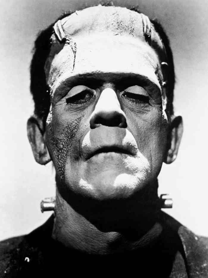
Aaron Johnson, has made himself well known through his ongoing series of daily comics featuring a main cartoon named W.T. Duck, a photographer. He began making comics just as a blog filler, but has largely grown in popularity. His comics are published daily in many newspapers as well as several websites including the yahoo news section which is where I first saw it. Johnson's personal website, whattheduck.net, contains fan commentary as well as every wt duck comic he has ever published. Johnson also openly takes criticism and suggestions via twitter and email on his website which I found interesting. The fact that Johnson did begin his career as a blogger is important because we then know he is the type of person that likes to get his ideas out there for the world to see. We should remember that this is his motivation for creating the comics while we analyze them. The comic above is the one I am choosing to analyze for for this second project. It is part of Aaron Johnsons WT Duck series and was published a few days before Halloween of this year. The scene has the photographer, wt duck, telling five monsters that he charges extra for Ugly. Frankenstien responds by yelling "That's Discrimination," followed by the next three monsters swearing. Lastly the invisible man says, "sweet." The reason this comic stood out to me was because I found the dialogue really funny. One thing that is important to notice about this comic though is that Johnson chooses to act against several standard mechanics that one would find in a standard comic strip. These include use of framing, location of quotes, and levels of detail. Rhetorically, these mechanics contradict the subject matter within the comic strip and argue that discrimination is never toward just one group and often has an effect on evrybody, regaurdless of the target. If one looks at the WT Duck comic and then the comic above, they first appear very similar in style. They both include three frames, illustrated cartoons and dialougue bubbles. The key to the argument of Johnsons comic though is where he chosses to diferentiate his style from that of a more traditional comic. The first difference I noticed was Johnsons use of frames. In a traditional comic, you will see each frame present either a different scene of timeframe. On the other hand, Johnsons three frames all apear to be responding to the same event at the same moment in time, and even appear to be located sequentially. For example the whiches broom crosses over from one frame to the next and the grey foreground is persistant throughout. These three frames now appear to be a tool for describing the organization of space, instead of time. I beieve this choice was made largely due to Johnsons desire to remain consistant in terms of ethos almost all of his other comics are structured with the three frame style. However it is also important to look at why then he choose to only portrey one scene to represent this situation. The comic can be divided into two elements. The photographer(duck), and the monsters all responding to him. They appear to be in a line waiting for his service and it is suggested that all but the invisible man will be charged extra. The effect the three frames has on me is it devides the second element, the monsters, apart from each other who I would otherwise have in my mind grouped together as just all monsters. So, it is possible that Johnsons strategy was to use the frames to create a division in the charactors that the audience otherwise would not have picked up on, yet still keep the scene together as one whole. Nextly, Johnson furthur divides these three frames by making the backgrounds distinctly different colors. In a traditional comic, like the one above, you will normally only see one consistant background color. These colors not only make the divison in frames more visible, but also act to set a mood, distinct to each frame. For example, in the first frame, Orange is used, which is a bright, intense color, and could be assosiated with the intense reaction from the Frankenstien monster to the duck. The second frame is white which could suggest indifference and the last frame is purple and could represent sadness. These different moods are important because although all of the monsters appear to be reacting the same, it is possible that the backgrounds reflect their true emotions on the situation. This become particularly important with the invisible man in the back because although it appears he is getting what he wants, the fact that he is at the back of the line and in the purple depressing background could suggest that he is unhappy. If we go back to the topic of dicrimination and the re-examine this scenario with respect to background representing mood, this comic now appears to be showing that the invisible man, although not directly disciminated against, may in fact be just as unhappy as the some of the other monsters who are. It is important to recognize that the invisible man himself could easilly be referencing the novel "Invisible Man."(Ralph Ellison) This book in particular expressed the social issues facing african americans during the early twentieth century and largely played to this idea of how being "invisible" was the only way to avoid discrimination.(Wikipedia)

Next I would like to focus on Johnsons choice of positioning for his quotation bubbles. It you look at the second comic I posted, you can see that traditionally, quotations are read from top to bottom, left to right, and never cover the characters face. If you examine Johnsons comic, first you will see that the sequence of quotes starts at the bottom left instead of the top left. This naturally causes the audience to see the quote, "Thats Discrimination!" before the first quote in the conversation. This automaticly sets the topic of discussion and mindset of the audience to discrimination before they even know whats going on in the rest of the situation. This could serve several puposes. For example, Johnson could be trying to make a point that this is how people act in society today, that people jump to conclusions before analyzing situations. Johnson could have also chosen to do this to bring the topic of discimination to the mindset of the audience first, before the comedy in the rest of the strip was able to take over. The second interesting choice Johnson makes in terms of the quotation positioning is that several of the quotes actually cover the faces of the charactors. When the face of a charactor is not shown, their identity becomes much less of a focal point. One could conclude that johnson chose to do this to represent the lack of importance that the actual identity of the discriminated against holds. The fact that the mosters face is covered represents that the duck dosnt really even care who they are, he instead just see's them swearing at him, and moves on. We an also assume this because when a charactor says something, but you cant see their face, it conveys a feeling that they are being ignored or not listened to. It is also important to note that this comic provides no sort of response on the part of the duck to what the monsters are saying, which could furthur argure the point that he doesnt really care. In terms of the rhetorical argument, I feel this adds to the discrimination scenario being created as people who are being discriminated against often feel like they dont have a voice. The people discriminating often don't care what there victims think or who they are, and often just continue doing it.

A third major difference between this WT Duck comic and most other comics is that there is an apparent difference in level of detail illustrated between charactors. This goes back to the two elements I discribed earlier. First we have the duck, who in reality dosnt really resemble a duck at all, and only includes details such as a bill and dots for eyes. The second element, the monsters in contrast poses a relatively high level of detail all the way down to creases in clothing and skin. The effect this creates is a widened separation between the photographer, and discriminator from the monsters. The high level of detail in the monsters make them seem much more "real" in the eyes of the audience than the simplified duck, even though in reality ducks exist and monsters dont. Johnsons strategy was likely to make the monsters be the element in the comic in which the audience related, causing them, in a way, to feel the same "discrimination" which the monsters are going through. This apeals to the overall Pathos of the comic, bringing out an emotional response from the audience with respect to the argument.

In the end, the majority of people who saw this comic just got a quick laugh and then moved on, so what then is the signifigance of these rhetorical strategies? Often time texts can influence our thoughts, feelings and attitudes without us being consiously aware. While we may not know exactly what Johnsons feelings are on certain topics, we can assume that his work is a direct reflection and with this comic in particular, we for sure know the topic of discrimination was what he wanted to draw to attention based on his particular mechanics he chose. \When the audience sees this comic, the topic of discrimination is brought up in their minds and then the rest of the comic acts as a medium to possibly redirect their thoughts on the issue.

Thursday, November 12, 2009

WP2: 1st revision


Aaron Johnson, has made himself well known through his ongoing series of daily comics featuring a main cartoon named W.T. Duck, a photographer. He began making comics just as a blog filler, but has largely grown in popularity. His comics are published daily in many newspapers as well as several websites including the yahoo news section which is where I first saw it. Johnson's personal website, whattheduck.net, contains fan commentary as well as every wt duck comic he has ever published. Johnson also openly takes criticism and suggestions via twitter and email on his website which I found interesting. The fact that Johnson did begin his career as a blogger is important because we then know he is the type of person that likes to get his ideas out there for the world to see. We should remember that this is his motivation for creating the comics while we analyze them.
The comic above is the one I am choosing to analyze for for this second project. It is part of Aaron Johnsons WT Duck series and was published a few days before Halloween of this year. The scene has the photographer, wt duck, telling five monsters that he charges extra for Ugly. Frankenstien responds by yelling "That's Discrimination," followed by the next three monsters swearing. Lastly the invisible man says, "sweet." The reason this comic stood out to me was because I found the dialogue really funny. One thing that is important to notice about this comic though is that Johnson chooses to act against several standard mechanics that one would find in a standard comic strip. Rhetorically, these mechanics contradict the subject matter within the comic strip and argue that discrimination is never toward just one group and often has an effect on evrybody, regaurdless of the target.
If one looks at the WT Duck comic and then the comic above, they first appear very similar in style. They both include three frames, illustrated cartoons and dialougue bubbles. The key to the argument of Johnsons comic though is where he chosses to diferentiate his style from that of a more traditional comic. The first difference I noticed was Johnsons use of frames. In a traditional comic, you will see each frame present either a different scene of timeframe. On the other hand, Johnsons three frames all apear to be responding to the same event at the same moment in time, and even appear to be located sequentially. For example the whiches broom crosses over from one frame to the next and the grey foreground is persistant throughout. I beieve this choice was made largely due to Johnsons desire to remain consistant in terms of ethos almost all of his other comics are structured with the three frame style. However it is also important to look at why then he choose to only portrey one scene to represent this situation. The comic can be divided into two elements. The photographer(duck), and the monsters all responding to him. They appear to be in a line waiting for his service and it is suggested that all but the invisible man will be charged extra. The effect the three frames has on me is it devides the second element, the monsters, apart from each other who I would otherwise have in my mind grouped together as just all monsters. So, it is possible that Johnsons strategy was to use the frames to create a division in the charactors that the audience otherwise would not have picked up on, yet still keep the scene together as one whole. Nextly, Johnson furthur divides these three frames by making the backgrounds distinctly different colors. In a traditional comic, like the one above, you will normally only see one consistant background color. These colors not only make the divison in frames more visible, but also act to set a mood, distinct to each frame. For example, in the first frame, Orange is used, which is a bright, intense color, and could be assosiated with the intense reaction from the Frankenstien monster to the duck. The second frame is white which could suggest indifference and the last frame is purple and could represent sadness. These different moods are important because although all of the monsters appear to be reacting the same, it is possible that the backgrounds reflect their true emotions on the situation. This become particularly important with the invisible man in the back because although it appears he is getting what he wants, the fact that he is at the back of the line and in the purple depressing background could suggest that he is unhappy. If we go back to the topic of dicrimination and the re-examine this scenario, this comic now appears to be showing that the only one who does not get discriminated against are the ones who stand in the back and do not stand out and that these people are the ones who are truely not happy.

Next I would like to focus on Johnsons choice of positioning for his quotation bubbles. It you look at the second comic I posted, you can see that traditionally, quotations are read from top to bottom, left to right, and never cover the characters face. If you examine Johnsons comic, first you will see that the sequence of quotes starts at the bottom left instead of the top left. This naturally causes the audience to see the quote, "Thats Discrimination!" before the first quote in the conversation. This automaticly sets the topic of discussion and mindset of the audience to discrimination before they even know whats going on in the rest of the situation. This could serve several puposes. For example, Johnson could be trying to make a point that this is how people act in society today, that people jump to conclusions before analyzing situations. Johnson could have also chosen to do this to bring the topic of discimination to the mindset of the audience first, before the comedy in the rest of the strip was able to take over. The second interesting choice Johnson makes in terms of the quotation positioning is that several of the quotes actually cover the faces of the charactors. This directly takes away from the charactor's identity and deflects attention towards what they are saying. There are a variety of possible puposes for this, but I feel that the efect it has on this situation in particular is that it shows a lack of effect of the particular charactor's response. For example, when a charactor says something, but you cant see their face, it conveys a feeling that they are being ignored or not listened to. This could be referring to the duck and how he may not care what the monsters think. In terms of the rhetorical argument, I feel this adds to the discrimination scenario being created as people who are being discriminated against often feel like they dont have a voice.

A third major difference between this WT Duck comic and most other comics is that there is an apparent difference in level of detail illustrated between charactors. This goes back to the two elements I discribed earlier. First we have the duck, who in reality dosnt really resemble a duck at all, and only includes details such as a bill and dots for eyes. The second element, the monsters in contrast poses a relatively high level of detail all the way down to creases in clothing and skin. The effect this creates is a widened separation between the photographer, and discriminator from the monsters. The high level of detail in the monsters make them seem much more "real" in the eyes of the audience than the simplified duck, even though in reality ducks exist and monsters dont. Johnsons strategy was likely to make the monsters be the element in the comic in which the audience related, causing them, in a way, to feel the same "discrimination" which the monsters are going through. This apeals to the overall Pathos of the comic, bringing out an emotional response from the audience with respect to the argument.

In the end, the majority of people who saw this comic just got a quick laugh and then moved on, so what then is the signifigance of these rhetorical strategies? Often time texts can influence our thoughts, feelings and attitudes without us being consiously aware. While we may not know exactly what Johnsons feelings are on certain topics, we can assume that his work is a direct reflection and with this comic in particular, we for sure know the topic of discrimination was what he wanted to draw to attention based on his particular mechanics he chose. \When the audience sees this comic, the topic of discrimination is brought up in their minds and then the rest of the comic acts as a medium to possibly redirect their thoughts on the issue.


Monday, November 9, 2009

WP2: Rough Draft


Aaron Johnson, has made himself well known through his ongoing series of daily comics featuring a main cartoon named W.T. Duck, a photographer. His comics are published daily in many newspapers as well as several websites including the yahoo news section which is where I first saw it. Johnson's personal website, whattheduck.net, contains fan commentary as well as every wt duck comic he has ever published.


The comic above is the one I am choosing to analyze for for this second project. It is part of Aaron Johnsons WT Duck series and was published a few days before Halloween of this year. The scene has the photographer, wt duck, telling five monsters that he charges extra for Ugly. Frankenstien responds by yelling "That's Discrimination," followed by the next three monsters swearing. Lastly the invisible man says, "sweet." The reason this comic stood out to me was because I found the dialogue really funny. One thing that is important to notice about this comic though is that Johnson chooses to act against several standard mechanics that one would find in a standard comic strip. Rhetorically, these mechanics contradict the subject matter within the comic strip and argue that discrimination is never toward just one group and often has an effect on evrybody, regaurdless of the target.
If one looks at the WT Duck comic and then the comic above, they first appear very similar in style. They both include three frames, illustrated cartoons and dialougue bubbles. The key to the argument of Johnsons comic though is where he chosses to diferentiate his style from that of a more traditional comic. The first difference I noticed was Johnsons use of frames. In a traditional comic, you will see each frame present either a different scene of timeframe. On the other hand, Johnsons three frames all apear to be responding to the same event at the same moment in time, and even appear to be located sequentially. For example the whiches broom crosses over from one frame to the next and the grey foreground is persistant throughout. I beieve this choice was made largely due to Johnsons desire to remain consistant in terms of ethos almost all of his other comics are structured with the three frame style. However it is also important to look at why then he choose to only portrey one scene to represent this situation. The comic can be divided into two elements. The photographer(duck), and the monsters all responding to him. They appear to be in a line waiting for his service and it is suggested that all but the invisible man will be charged extra. The effect the three frames has on me is it devides the second element, the monsters, apart from each other who I would otherwise have in my mind grouped together as just all monsters. So, it is possible that Johnsons strategy was to use the frames to create a division in the charactors that the audience otherwise would not have picked up on, yet still keep the scene together as one whole. Nextly, Johnson furthur divides these three frames by making the backgrounds distinctly different colors. In a traditional comic, like the one above, you will normally only see one consistant background color. These colors not only make the divison in frames more visible, but also act to set a mood, distinct to each frame. For example, in the first frame, Orange is used, which is a bright, intense color, and could be assosiated with the intense reaction from the Frankenstien monster to the duck. The second frame is white which could suggest indifference and the last frame is purple and could represent sadness. These different moods are important because although all of the monsters appear to be reacting the same, it is possible that the backgrounds reflect their true emotions on the situation. This become particularly important with the invisible man in the back because although it appears he is getting what he wants, the fact that he is at the back of the line and in the purple depressing background could suggest that he is unhappy. If we go back to the topic of dicrimination and the re-examine this scenario, this comic now appears to be showing that the only one who does not get discriminated against are the ones who stand in the back and do not stand out and that these people are the ones who are truely not happy.


Next I would like to focus on Johnsons choice of positioning for his quotation bubbles. It you look at the second comic I posted, you can see that traditionally, quotations are read from top to bottom, left to right, and never cover the characters face. If you examine Johnsons comic, first you will see that the sequence of quotes starts at the bottom left instead of the top left. This naturally causes the audience to see the quote, "Thats Discrimination!" before the first quote in the conversation. This automaticly sets the topic of discussion and mindset of the audience to discrimination before they even know whats going on in the rest of the situation. This could serve several puposes. For example, Johnson could be trying to make a point that this is how people act in society today, that people jump to conclusions before analyzing situations. Johnson could have also chosen to do this to bring the topic of discimination to the mindset of the audience first, before the comedy in the rest of the strip was able to take over. The second interesting choice Johnson makes in terms of the quotation positioning is that several of the quotes actually cover the faces of the charactors. This directly takes away from the charactor's identity and deflects attention towards what they are saying. There are a variety of possible puposes for this, but I feel that the efect it has on this situation in particular is that it shows a lack of effect of the particular charactor's response. For example, when a charactor says something, but you cant see their face, it conveys a feeling that they are being ignored or not listened to. This could be referring to the duck and how he may not care what the monsters think. In terms of the rhetorical argument, I feel this adds to the discrimination scenario being created as people who are being discriminated against often feel like they dont have a voice.

A third major difference between this WT Duck comic and most other comics is that there is an apparent difference in level of detail illustrated between charactors. This goes back to the two elements I discribed earlier. First we have the duck, who in reality dosnt really resemble a duck at all, and only includes details such as a bill and dots for eyes. The second element, the monsters in contrast poses a relatively high level of detail all the way down to creases in clothing and skin. The effect this creates is a widened separation between the photographer, and discriminator from the monsters. The high level of detail in the monsters make them seem much more "real" in the eyes of the audience than the simplified duck, even though in reality ducks exist and monsters dont. Johnsons strategy was likely to make the monsters be the element in the comic in which the audience related, causing them, in a way, to feel the same "discrimination" which the monsters are going through. This apeals to the overall Pathos of the comic, bringing out an emotional response from the audience with respect to the argument.

Tuesday, November 3, 2009

WP2: Statement of Purpose

For my second project I have chosen to analyze the comic strip shown above. I found this comic a couple days before Halloween posted on the news section of the yahoo website and was illustrated by a man named Aaron Johnson. My primary audience for this project will be Mr. Ware, my teacher. He is the most important audience because he will be the one placing a grade on my work and likely will look at it the most extensively. The most likely secondary audience I also have to take into account will be my fellow classmates because several of them will see my work through the pier review process. With these two audiences in mind, the most effective way for me to format my project will be to state the point i am making, then clearly support the claim with several, clearly written paragraphs followed by a summarizing conclusion. This will allow my paper to be easily interpreted by both my audiences. It is also important to keep in mind that the medium in which I am writing is a blogpost as opposed to a paper or an article. As far as my project goes, this means that my audience will be viewing my text from a computer screen. Sense my project is based off of a comic strip, I need to make sure that my chosen comic appears clearly on the computer screen so that my audience has something to refer to while I am making my points. It will also be important for me to make effective use of paragraph spacing and indentation to best help the audience follow my paper while viewing it from a screen. The point I intend on making in my project is that The Halloween comic above Is not only intended to be comical, but also argues that some functions in todays society are set up to only benefit a select few. Johnson accomplishes this through text, visual hierarchy, vectors of attention and contrasting elements.
The context in which this project will be composed is simply as a writing project in early November through the medium of a blog posting website. It will include traditional text as well as multiple hyperlinks and multimedia elements. My goal should be to make all three of these things work together effectively to help support the my point. It may be hard for my audience to see where I am coming from with my view that the comic represents an unfair distribution of rewards in society, so I will first need to establish what I feel each of the separate elements represents, and then build on how the separate elements work together to make the point that I see. My goal isnt necessarily to make my audience agree with me, but at least show them my point of view and logically take them through my thought process. To do this I also plan on an in depth analysis on what I feel the logos, pathos and ethos within the comic appeal to.

Thursday, October 29, 2009

Blog Post 12: Comic Background Info.


I found my chosen comic strip from the news section of the yahoo website. It comes from a series of comic strips entitled W.T. Duck written by Aaron Johnson. He publishes a new strip every day on a site named whattheduck.net. The comic strips cover a variety of comical subjects, and every one of them feature a duck working as a photographer as the main character. Another thing all of Johnsons strips have in common is they are always three frames in length. Sometimes each frame acts as a separate seen and other times, like in my chosen comic, the three frames act together as one.
As far as the context goes, we know that Aaron Johnsons main goal when making any of his comics is to have them be consistantly funny, so that in turn, websites like yahoo publish them daily. This helps Johnson to build his audience as well as make more money. The particular comic I chose was published on October 27 of this year, so we know that this comic is very recent and is likely rhetoricly dealing with issues of modern day society.
When I origionally saw the comic strip, I kind of had a clew that this series of comics always included a duck, just based on the title. What I didnt pick up untill after was that this duck was always a photogropher. It's hard to say for certain why Johnson chose this particular profession for the duck, but I would guess that a photogropher acts to represent bot the average working class American, as well as possibly just a third party observer of situations. After looking through some of Johnsons older comics, i also noticed that the cartoons included besides the duck are normally either another duck, or humans. In my chosen comic, he instead chooses to incorporate monsters. This is probably largely due to the fact that it is near holloween, but also could be that this comic pokes alittle at discrimination and it may have ben uncomfurtable to place human charactors in this situation.
The chosen medium is also a large factor in the context of this piece. When people see this text, they will likely be either brousing through comic strips in the newspaper or skimming through the comics page of some website. This means that the target audience will likely be in a sort of mood for laughter and comic relief. This is a far diferent situation then in Johnson was trying to make a point through the medium of writing a book or publishing an article, just beacuase people would not view it in the same light. Johnson uses the medium of a comic to discretly shape opinions of current issues he feels are important while the audience most of the time thinks they are just getting a good laugh.

Tuesday, October 27, 2009

Blog Post 11:comic strip

This is the comic I am going to analyze. I chose this comic because at first appearence it is simple, funny, and to the point. The interactions between my characters are visually develloped by five common monsters all focussed on a duck to the far left of the strip, holding a camera. The interactions betwween my characters are textually developed by the duck stating, "I bill for my time, The ugly get charged more." The Frankenstein monster responds by calling it discrimination. The wearwolf, swamp monster and witch then all respond by what appears to be symbols representing a swear word and lastly, the invisible man says, "sweet!"
At first look, it is easy to just assume this comic is making a holoween joke, but one could also look at this piece with the perspective that the comic is playing to some idea or theme in todays society. For example, the holoween theme could be used to set up a current day context, The first four monsters could represent people who stand out in todays society, and the invisible man could represent one who stays under the radar. So, the rhetorical meaning of this comic could be something like those who stand out today get screwed over.
Another interesting component to look at is the quote by Frankenstien where he says, "That's Discrimination." This also sort of creates a sort of current day context as we hear people the topic of discrimination so much in the news. It also creates a sence of irony within the piece as every cartoon is extreemly different yet the duck can somehow still be accused of discrimination. This brings up another possible rhetorical meaning for this piece, that in today's society, its hard to do almost anything without being sued or accused of some sort of discrimination.
The relationship between the panels is established by a transition of colors from orange to white to purple backgrounds. It is interesting because these three boxes could easily all be put together to appear as one scene, but for some reason, the author decided to divide them. It is posible that this was incorporated as a strategy to create a visual heiarchy to bring the audiences eye from the left side of the comic to the right.

Sunday, October 18, 2009

WP1 Authors Note

The first thing I did when I was just starting with the rough draft of this paper was to come up with a thesis or direction to go with my paper. I looked back through the excersizes we had been doing for the past couple weeks and read through some of the ideas I had thrown out there already about my chosen photograph. I came down to having two possible rhetorical meaning for my photo which were highly contradictial to each other. One was that the author was making a statement about how the new elements and old emelents in Barcelona come together as one, and the other was that the author felt that commerialism was starting to overshadow parts of the city's history and culture. I ended up choosing to work with the second idea, mostly because it was the viewpoint that I figured less people could come up with themselves from the photo so I figured it would be much more fun to work with.
As far as the content of the paper itself goes, I really wanted to focus on the lighing and contrast within the photograph. Anytime you have a black and white photo, the contrast and balance of light and dark shades always plays a key role in conveying the photos meaning. My strategy was to break the photograph down into several smaller elements, analyze each of them individually, then relate them all back together to the photo as a whole.
As far as my revisions go, the first thing I did was added a meaningful conclusion which acted to tie all of the ideas throughout my paper together at the end. This included a "So What" statement as well as restating my thesis in a different way. I next added a couple photographs of parts of barcelona in which I fealt expressed some of the cities history or culture because in my paper, I am arguing that culture is being overshadowed. I slightly rephraised my origional thesis to be alittle less explicit and leave alitlle more room for interpretation on the part of the audience. On my final revision, I added alittle analysis in the conclusion of another photograph of the same area in barcelona. I fealt this helped to offer an additional perspective and also really helped build on the context of the Barcelona Nights photograph itself. I then mostly focussed on finding some additional facts about the history of Barcelona because if I was going to argue that the history was being overshadowed, it made sence to tell alittle about what that history was. I choose to incorporate most of this research near the beginning of my paper so the audience would be able to use it to build on the context behind the photo. Lastly, when analyzing the photograph one final time, I found a fw more, smaller elements, such as the lighting of the windows, which I decided also held some importance to the photos meaning so I chose to also incorporate alittle bit about that into my paper. Overall, I really enjoyed this project in comparison with writing projects I had done in the past, mostly because it left us so much room with self expression and developing our own ideas. We had some say in what we were writing about which definatly made the project more fun.

WP1 Final Draft

Barcelona, the Spanish capital, has a population of over 1,600,000 and is one of the major economic centers of Europe. One could closely compare its significance to Spain to that of New York City is to the United States because of its finance, commerce, media, entertainment, arts and international trade. The city's history is ledgendary, rumored to have been founded to Hercules, 400 years before the building of rome. While this may or may not have been the actual manner in which the Barcelona came into being, there is a definate romen influence present as anchient roman ruins can still be found there to this day. Barcelona has seen many different periods through spanish history including the spanish monarchy, civil war, Franquism and modern democracy. Today, Barcelona prides itself on the Placa Catalunya, which is known as the city's historical center where much of the old 19th century buildings and artwork can still be found. The city also prides itself on its 68 parks and 7 beaches, providing points of beauty throughout the city.(Wikipedia.com) The documentary photograph I have chosen to analyze is entitled “Barcelona Nights” and captures two of modern Barcelona’s most Iconic structures; The Torre Mapfre, a very large commercial building, and the Hotel Arts which includes a hotel, casino, shopping center and restaurants. I feel that the lighting, contrast of colors, and visual heiarchy are the elements which play a key role in expressing the argument that Barcelona's rich historical culture is fading away behind the rapid urbanization of the city.

“Barcelona Nights” was documented on May 25, of 2009 by Liam McAllister. (pool.org.au)Anytime that a photographer chooses for his work to remain in black and white, there is usually an important reason behind it, so I felt analyzing the rhetorical strategy behind this color choice would be a good place to start. In the photo, the ground and the sky are almost completely black. What seems to appear in between and almost divide these two elements is an illuminated, triangle shaped area of white light. This illusion of a triangle is formed by two very bright street lights at ground level, and then a bright display on the top of one of the towers. This works to create hierarchy within the photo where the audience first focuses on what is highlighted by the center of the triangle, the two towers, and then work their way out towards the corners. These buildings, with the exception of some illuminated windows, appear almost black within this illusion of a white triangle which create a heavy contrast and helps to emphasize this hierarchy. This lighting strategy brings logos to the piece with respect to its argument. For example at first glance, almost anyone who looks at this picture is going to see the two tall buildings due to their positioning and high contrast, but if one spends a little longer examining the photograph, they may also see a few other small structures as well as some palm trees, sort of hidden by the shadows. This in itself makes the statement that the two tall structures in the center are overshadowing and drawing attention from whatever else is in the photograph. We can also choose to view the greystyle coloring as a method to historisize the photograph as a whole. Black and white is naturally what you think of when you consider "old" photographs, and although this photo was taken this year, it is possible that the photographer wanted the audience to interprit this piece through a different context. The rhetorical strategy behind this could have been for the audience to see this photo as historical, and then easilly be able to pick out what in the photo dosnt "belong."

Next I chose to look at the sources of lighting in the photo itself. As stated earlier, the three brightest areas in the photo are positioned in such a way as to form a sort of equilateral triangle, dividing the piece, and directing attention towards the center. The manner in which the lights appear is also important. The light to the left of the photo is by far the brightest and is almost two bright to see what exactly is its source. The light near the top of the photo is caused by spotlights along the tom edge of one of the towers. The light to the right of the photo appears to be caused by two streetlamps very near each other. The fact that the light to the left of the photo is so overpowering and even drowns out some of the photograph creates a sort of imbalance and tension with what seems to be the focus of the piece. One possible explanation for the photographer’s decision to include this imbalance may have been to appeal to the pathos of the argument, or how the audience feels when they view the photo. For example, If the audience feels the photograph itself contains some tension, it is also possible they may relate this feeling of tension towards the city of Barcelona itself. If the center of focus is these two highly commercial buildings, then this tension may be a reflection upon them suggesting that they possibly don’t belong.

In a black and white photograph, the contrast often plays an even larger role in determining the photo’s meaning to the audience. In “Barcelona Nights” in particular, there are even very few shades of grey used. The photo almost seems to be divided into what is illuminated, and what is not. As I already stated, the tall buildings which are dark form a contrast with the bright sky behind them, but there are also a few multiple other dark shaded elements, which I also believe hold significant meaning in this photograph. Mostly to the right of the two towers, you can make out the outline of several palm trees. They all appear to be fairly low to the ground, and the only tall one, ironically is almost hidden as it stacks on top of the dark color of the building. It is quite possible that the photographer intended these trees to represent a certain part of Spanish culture and maybe how he feels they are becoming insignificant. Barcelona is along the coast of the Mediterranean, and possibly the meaning of these palm trees being overshadowed is that the beauty of the Mediterranean itself is now being overlooked. On the other side of the two towers is what appears to be some low to the ground, older looking structure. Even though this object is obviously much closer to the camera then the buildings, it is still nearly impossible to make out what exactly the structure is. I feel that the photographer also did this intentionally to build on the statement that the palm trees were making; that some of the historical parts of the city are falling into shadow. The fact that the audience cannot even identify what the building is possibly reflects that in Barcelona, smaller shops or businesses are losing popularity.
If one focusses on the lighting of the windows of the buildings themselves, it becomes apparent that one building is active at night and the otherone is not. In reality, this is simply because the building in the back, the Hotel Arts is a casino, and would often be busy at night time, but it is still important to analyze why then the photogropher chose to take this photo at night when one of the buildings were empty, and why the active building appears behind the empty one. I would say that his intention was to build on his rhetoric while playing with the visual heiarchy. For example, Having a building with no lights on right next to a building compltely lit up creates a very high contrast which draws attention. Then, the visual heiarchy will automaticly draw attention to which ever structure is in front. So with this contrast in the audience's mind they will naturally develop a feeling of emptness with this empty building being the highest on the visual heiarchy scale. The photographer likely wanted to use this effect to draw attention to the fact that the Barcelona night life of Casinos and hotels shouldnt be glorified, but is instead sort of an empty and dark theme, do inating the city.

So what could we say the photogropher himself truely wants the audience to take away from barcelona nights? The photograph dosnt really defame the Torre Mapfre or Hotel Arts in any way, but instead I think just tries to point out that somethings are being overlooked, or falling into the background. For example, in this last photo, we can see that the Hotel Arts and Torre Mapre in reality dont stand out nearly as much as they do in the Barcelona Nights photograph, so we might be able to assume that the photographer was trying to represent the cultural importance of the buildings as opposed to the structural. The way in which he makes them such a center of attention in the photo would imply that he believes what they represent has become the center of attention in the culture of Barcelona. We could say that he values the rich history of this historic spanish city and that he does not want to see it forgotten.

Thursday, October 15, 2009

WP1 Draft 2

Barcelona, the Spanish capital, has a population of over 1,600,000 and is one of the major economic centers of Europe. One could closely compare its significance to Spain to that of New York City is to the United States because of its finance, commerce, media, entertainment, arts and international trade.(Wikipedia.com)The documentary photograph I have chosen to analyze is entitled “Barcelona Nights” and captures two of Barcelona’s most Iconic structures; The Torre Mapfre, a very large commercial building, and the Hotel Arts which includes a hotel, casino, shopping center and restaurants. I feel that the lighting, contrast of colors, and visual heiarchy are the elements which play a key role in expressing the argument that Barcelona's rich historical culture is fading away behind the rapid urbanization of the city.

“Barcelona Nights” was documented on May 25, of 2009 by Liam McAllister. (pool.org.au)Anytime that a photographer chooses for his work to remain in black and white, there is usually an important reason behind it, so I felt analyzing the rhetorical strategy behind this color choice would be a good place to start. In the photo, the ground and the sky are almost completely black. What seems to appear in between and almost divide these two elements is an illuminated, triangle shaped area of white light. This illusion of a triangle is formed by two very bright street lights at ground level, and then a bright display on the top of one of the towers. This works to create hierarchy within the photo where the audience first focuses on what is highlighted by the center of the triangle, the two towers, and then work their way out towards the corners. These buildings, with the exception of some illuminated windows, appear almost black within this illusion of a white triangle which create a heavy contrast and helps to emphasize this hierarchy. This lighting strategy brings logos to the piece with respect to its argument. For example at first glance, almost anyone who looks at this picture is going to see the two tall buildings due to their positioning and high contrast, but if one spends a little longer examining the photograph, they may also see a few other small structures as well as some palm trees, sort of hidden by the shadows. This in itself makes the statement that the two tall structures in the center are overshadowing and drawing attention from whatever else is in the photograph. We can also choose to view the greystyle coloring as a method to historisize the photograph as a whole. Black and white is naturally what you think of when you consider "old" photographs, and although this photo was taken this year, it is possible that the photographer wanted the audience to interprit this piece through a different context. The rhetorical strategy behind this could have been for the audience to see this photo as historical, and then easilly be able to pick out what in the photo dosnt "belong."

Next I chose to look at the sources of lighting in the photo itself. As stated earlier, the three brightest areas in the photo are positioned in such a way as to form a sort of equilateral triangle, dividing the piece, and directing attention towards the center. The manner in which the lights appear is also important. The light to the left of the photo is by far the brightest and is almost two bright to see what exactly is its source. The light near the top of the photo is caused by spotlights along the tom edge of one of the towers. The light to the right of the photo appears to be caused by two streetlamps very near each other. The fact that the light to the left of the photo is so overpowering and even drowns out some of the photograph creates a sort of imbalance and tension with what seems to be the focus of the piece. One possible explanation for the photographer’s decision to include this imbalance may have been to appeal to the pathos of the argument, or how the audience feels when they view the photo. For example, If the audience feels the photograph itself contains some tension, it is also possible they may relate this feeling of tension towards the city of Barcelona itself. If the center of focus is these two highly commercial buildings, then this tension may be a reflection upon them suggesting that they possibly don’t belong.

In a black and white photograph, the contrast often plays an even larger role in determining the photo’s meaning to the audience. In “Barcelona Nights” in particular, there are even very few shades of grey used. The photo almost seems to be divided into what is illuminated, and what is not. As I already stated, the tall buildings which are dark form a contrast with the bright sky behind them, but there are also a few multiple other dark shaded elements, which I also believe hold significant meaning in this photograph. Mostly to the right of the two towers, you can make out the outline of several palm trees. They all appear to be fairly low to the ground, and the only tall one, ironically is almost hidden as it stacks on top of the dark color of the building. It is quite possible that the photographer intended these trees to represent a certain part of Spanish culture and maybe how he feels they are becoming insignificant. Barcelona is along the coast of the Mediterranean, and possibly the meaning of these palm trees being overshadowed is that the beauty of the Mediterranean itself is now being overlooked. On the other side of the two towers is what appears to be some low to the ground, older looking structure. Even though this object is obviously much closer to the camera then the buildings, it is still nearly impossible to make out what exactly the structure is. I feel that the photographer also did this intentionally to build on the statement that the palm trees were making; that some of the historical parts of the city are falling into shadow. The fact that the audience cannot even identify what the building is possibly reflects that in Barcelona, smaller shops or businesses are losing popularity.


So what could we say the photogropher himself truely wants the audience to take away from barcelona nights? The photograph dosnt really defame the Torre Mapfre or Hotel Arts in any way, but instead I think just tries to point out that somethings are being overlooked, or falling into the background. We could say that he values the rich history of this historic spanish city and that he does not want to see it forgotten.