Wednesday, November 18, 2009

WP3 prewrite 1


As far as my past experience with art objects goes, I would have to say it has mostly been limited to elementary/middle school art classes and field trips to museums. Im done many small art projects throughout my school carrier just like everybody else, so I feel it is most important to try to identify what in particular most largly influences my outlook on art in general and to what style do I reference back to when judging the success of a particular piece. I am not too experienced with different styles of art, but there has been one that always stands out in my mind. While I lived in Australia, I was able to see many examples of Aborigine style artwork which to this day is my favorite in terms of both style and subject. I like this style of artwork so much because it is completely unique, visually engaging, reflects Australian culture, and often tells a story. A rough description of this style is the use of a large number of dots to form shapes, patterns and objects, which often reflect some aspect of Australian nature. There is also almost always some sort of story being told, even though many times it is hard to say exactly what that story is without talking to the artist. This leaves the interpretation completely up to the audience and I feel that this adds interest to the artwork itself. For example, the example to the right obviously portrays a kangaroo as the main vector of attention, but what the kangaroo is doing, and what the circles behind him represent is up to the audiences interpretation. Aboriginal art combines realistic art with abstract art as you can almost always tell what is in the piece, but it is represented by a large variety of dots instead of the actual lines.
With respect to my overall experience with art, I would then say that Aboriginal art has definitely had the largest influence on me in terms of how I view art universally. For example, if someone were to show me a painting, I would immediately try to identify the subject matter first, just as is a custom when viewing aboriginal artwork. I also am able to appreciate artwork much more that maintains a certain level of realism, similar to aboriginal art, where even though it may not be exact, my mind can still identify what I am looking at.

Tuesday, November 17, 2009

WP2: Final Draft / Author's Note

Authors Note:
In the first revision, in my opening paragraph, I chose to add an explanation as to why Johnson's background as a blogger is relevent to the argument of his comic. I also decided to slightly reword my thesis statement/argument to say, "Rhetorically, these mechanics contradict the subject matter within the comic strip and argue that discrimination is never toward just one group and often has an effect on evrybody, regaurdless of the target," because I fealt that my origional thesis was too much of an assumption and didnt really hold any meaning to investigate. I added a separate conclusion paragraph which I had been missing where I attempt to offer possible rational as to why Johnson chose to make his argument in the form of a comic. For my final draft, I first added alittle more to my thesis, specificly outlining the mechanics of the comic that I planned to analyze. In my paragraph analyzing johnsons use of frames, I chose to re summarize what effect Johnsons choice of background color had on the rhetorical meaning. It now reads, "If we go back to the topic of dicrimination and the re-examine this scenario with respect to background representing mood, this comic now appears to be showing that the invisible man, although not directly disciminated against, may in fact be just as unhappy as the some of the other monsters who are." In that same paragraph, I also added a couple sentences stating how johnsons use of phrames describes space, as opposed to time. Next I chose to pretty much rewrite the second half of my paragraph about the location of the quotation bubbles. I feelt that it was unorganized origionally so I tried to rewrite it in a manner that better tied all of the ideas together. Next I chose to add a small analysis to the signifigance of the invisible man charactor himself, as I fealt he held specific imortance to the argument about those who are not discriminated against. Lastly, I added multiple hyperlinks to help bring understanding to some of my wordchoice as well as a couple in-text citations.
WP2: Rough Draft 2
WP2: Rough Draft 1
Statement of Purpose


WP2: Final Draft-

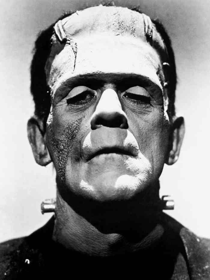
Aaron Johnson, has made himself well known through his ongoing series of daily comics featuring a main cartoon named W.T. Duck, a photographer. He began making comics just as a blog filler, but has largely grown in popularity. His comics are published daily in many newspapers as well as several websites including the yahoo news section which is where I first saw it. Johnson's personal website, whattheduck.net, contains fan commentary as well as every wt duck comic he has ever published. Johnson also openly takes criticism and suggestions via twitter and email on his website which I found interesting. The fact that Johnson did begin his career as a blogger is important because we then know he is the type of person that likes to get his ideas out there for the world to see. We should remember that this is his motivation for creating the comics while we analyze them. The comic above is the one I am choosing to analyze for for this second project. It is part of Aaron Johnsons WT Duck series and was published a few days before Halloween of this year. The scene has the photographer, wt duck, telling five monsters that he charges extra for Ugly. Frankenstien responds by yelling "That's Discrimination," followed by the next three monsters swearing. Lastly the invisible man says, "sweet." The reason this comic stood out to me was because I found the dialogue really funny. One thing that is important to notice about this comic though is that Johnson chooses to act against several standard mechanics that one would find in a standard comic strip. These include use of framing, location of quotes, and levels of detail. Rhetorically, these mechanics contradict the subject matter within the comic strip and argue that discrimination is never toward just one group and often has an effect on evrybody, regaurdless of the target. If one looks at the WT Duck comic and then the comic above, they first appear very similar in style. They both include three frames, illustrated cartoons and dialougue bubbles. The key to the argument of Johnsons comic though is where he chosses to diferentiate his style from that of a more traditional comic. The first difference I noticed was Johnsons use of frames. In a traditional comic, you will see each frame present either a different scene of timeframe. On the other hand, Johnsons three frames all apear to be responding to the same event at the same moment in time, and even appear to be located sequentially. For example the whiches broom crosses over from one frame to the next and the grey foreground is persistant throughout. These three frames now appear to be a tool for describing the organization of space, instead of time. I beieve this choice was made largely due to Johnsons desire to remain consistant in terms of ethos almost all of his other comics are structured with the three frame style. However it is also important to look at why then he choose to only portrey one scene to represent this situation. The comic can be divided into two elements. The photographer(duck), and the monsters all responding to him. They appear to be in a line waiting for his service and it is suggested that all but the invisible man will be charged extra. The effect the three frames has on me is it devides the second element, the monsters, apart from each other who I would otherwise have in my mind grouped together as just all monsters. So, it is possible that Johnsons strategy was to use the frames to create a division in the charactors that the audience otherwise would not have picked up on, yet still keep the scene together as one whole. Nextly, Johnson furthur divides these three frames by making the backgrounds distinctly different colors. In a traditional comic, like the one above, you will normally only see one consistant background color. These colors not only make the divison in frames more visible, but also act to set a mood, distinct to each frame. For example, in the first frame, Orange is used, which is a bright, intense color, and could be assosiated with the intense reaction from the Frankenstien monster to the duck. The second frame is white which could suggest indifference and the last frame is purple and could represent sadness. These different moods are important because although all of the monsters appear to be reacting the same, it is possible that the backgrounds reflect their true emotions on the situation. This become particularly important with the invisible man in the back because although it appears he is getting what he wants, the fact that he is at the back of the line and in the purple depressing background could suggest that he is unhappy. If we go back to the topic of dicrimination and the re-examine this scenario with respect to background representing mood, this comic now appears to be showing that the invisible man, although not directly disciminated against, may in fact be just as unhappy as the some of the other monsters who are. It is important to recognize that the invisible man himself could easilly be referencing the novel "Invisible Man."(Ralph Ellison) This book in particular expressed the social issues facing african americans during the early twentieth century and largely played to this idea of how being "invisible" was the only way to avoid discrimination.(Wikipedia)

Next I would like to focus on Johnsons choice of positioning for his quotation bubbles. It you look at the second comic I posted, you can see that traditionally, quotations are read from top to bottom, left to right, and never cover the characters face. If you examine Johnsons comic, first you will see that the sequence of quotes starts at the bottom left instead of the top left. This naturally causes the audience to see the quote, "Thats Discrimination!" before the first quote in the conversation. This automaticly sets the topic of discussion and mindset of the audience to discrimination before they even know whats going on in the rest of the situation. This could serve several puposes. For example, Johnson could be trying to make a point that this is how people act in society today, that people jump to conclusions before analyzing situations. Johnson could have also chosen to do this to bring the topic of discimination to the mindset of the audience first, before the comedy in the rest of the strip was able to take over. The second interesting choice Johnson makes in terms of the quotation positioning is that several of the quotes actually cover the faces of the charactors. When the face of a charactor is not shown, their identity becomes much less of a focal point. One could conclude that johnson chose to do this to represent the lack of importance that the actual identity of the discriminated against holds. The fact that the mosters face is covered represents that the duck dosnt really even care who they are, he instead just see's them swearing at him, and moves on. We an also assume this because when a charactor says something, but you cant see their face, it conveys a feeling that they are being ignored or not listened to. It is also important to note that this comic provides no sort of response on the part of the duck to what the monsters are saying, which could furthur argure the point that he doesnt really care. In terms of the rhetorical argument, I feel this adds to the discrimination scenario being created as people who are being discriminated against often feel like they dont have a voice. The people discriminating often don't care what there victims think or who they are, and often just continue doing it.

A third major difference between this WT Duck comic and most other comics is that there is an apparent difference in level of detail illustrated between charactors. This goes back to the two elements I discribed earlier. First we have the duck, who in reality dosnt really resemble a duck at all, and only includes details such as a bill and dots for eyes. The second element, the monsters in contrast poses a relatively high level of detail all the way down to creases in clothing and skin. The effect this creates is a widened separation between the photographer, and discriminator from the monsters. The high level of detail in the monsters make them seem much more "real" in the eyes of the audience than the simplified duck, even though in reality ducks exist and monsters dont. Johnsons strategy was likely to make the monsters be the element in the comic in which the audience related, causing them, in a way, to feel the same "discrimination" which the monsters are going through. This apeals to the overall Pathos of the comic, bringing out an emotional response from the audience with respect to the argument.

In the end, the majority of people who saw this comic just got a quick laugh and then moved on, so what then is the signifigance of these rhetorical strategies? Often time texts can influence our thoughts, feelings and attitudes without us being consiously aware. While we may not know exactly what Johnsons feelings are on certain topics, we can assume that his work is a direct reflection and with this comic in particular, we for sure know the topic of discrimination was what he wanted to draw to attention based on his particular mechanics he chose. \When the audience sees this comic, the topic of discrimination is brought up in their minds and then the rest of the comic acts as a medium to possibly redirect their thoughts on the issue.

Thursday, November 12, 2009

WP2: 1st revision


Aaron Johnson, has made himself well known through his ongoing series of daily comics featuring a main cartoon named W.T. Duck, a photographer. He began making comics just as a blog filler, but has largely grown in popularity. His comics are published daily in many newspapers as well as several websites including the yahoo news section which is where I first saw it. Johnson's personal website, whattheduck.net, contains fan commentary as well as every wt duck comic he has ever published. Johnson also openly takes criticism and suggestions via twitter and email on his website which I found interesting. The fact that Johnson did begin his career as a blogger is important because we then know he is the type of person that likes to get his ideas out there for the world to see. We should remember that this is his motivation for creating the comics while we analyze them.
The comic above is the one I am choosing to analyze for for this second project. It is part of Aaron Johnsons WT Duck series and was published a few days before Halloween of this year. The scene has the photographer, wt duck, telling five monsters that he charges extra for Ugly. Frankenstien responds by yelling "That's Discrimination," followed by the next three monsters swearing. Lastly the invisible man says, "sweet." The reason this comic stood out to me was because I found the dialogue really funny. One thing that is important to notice about this comic though is that Johnson chooses to act against several standard mechanics that one would find in a standard comic strip. Rhetorically, these mechanics contradict the subject matter within the comic strip and argue that discrimination is never toward just one group and often has an effect on evrybody, regaurdless of the target.
If one looks at the WT Duck comic and then the comic above, they first appear very similar in style. They both include three frames, illustrated cartoons and dialougue bubbles. The key to the argument of Johnsons comic though is where he chosses to diferentiate his style from that of a more traditional comic. The first difference I noticed was Johnsons use of frames. In a traditional comic, you will see each frame present either a different scene of timeframe. On the other hand, Johnsons three frames all apear to be responding to the same event at the same moment in time, and even appear to be located sequentially. For example the whiches broom crosses over from one frame to the next and the grey foreground is persistant throughout. I beieve this choice was made largely due to Johnsons desire to remain consistant in terms of ethos almost all of his other comics are structured with the three frame style. However it is also important to look at why then he choose to only portrey one scene to represent this situation. The comic can be divided into two elements. The photographer(duck), and the monsters all responding to him. They appear to be in a line waiting for his service and it is suggested that all but the invisible man will be charged extra. The effect the three frames has on me is it devides the second element, the monsters, apart from each other who I would otherwise have in my mind grouped together as just all monsters. So, it is possible that Johnsons strategy was to use the frames to create a division in the charactors that the audience otherwise would not have picked up on, yet still keep the scene together as one whole. Nextly, Johnson furthur divides these three frames by making the backgrounds distinctly different colors. In a traditional comic, like the one above, you will normally only see one consistant background color. These colors not only make the divison in frames more visible, but also act to set a mood, distinct to each frame. For example, in the first frame, Orange is used, which is a bright, intense color, and could be assosiated with the intense reaction from the Frankenstien monster to the duck. The second frame is white which could suggest indifference and the last frame is purple and could represent sadness. These different moods are important because although all of the monsters appear to be reacting the same, it is possible that the backgrounds reflect their true emotions on the situation. This become particularly important with the invisible man in the back because although it appears he is getting what he wants, the fact that he is at the back of the line and in the purple depressing background could suggest that he is unhappy. If we go back to the topic of dicrimination and the re-examine this scenario, this comic now appears to be showing that the only one who does not get discriminated against are the ones who stand in the back and do not stand out and that these people are the ones who are truely not happy.

Next I would like to focus on Johnsons choice of positioning for his quotation bubbles. It you look at the second comic I posted, you can see that traditionally, quotations are read from top to bottom, left to right, and never cover the characters face. If you examine Johnsons comic, first you will see that the sequence of quotes starts at the bottom left instead of the top left. This naturally causes the audience to see the quote, "Thats Discrimination!" before the first quote in the conversation. This automaticly sets the topic of discussion and mindset of the audience to discrimination before they even know whats going on in the rest of the situation. This could serve several puposes. For example, Johnson could be trying to make a point that this is how people act in society today, that people jump to conclusions before analyzing situations. Johnson could have also chosen to do this to bring the topic of discimination to the mindset of the audience first, before the comedy in the rest of the strip was able to take over. The second interesting choice Johnson makes in terms of the quotation positioning is that several of the quotes actually cover the faces of the charactors. This directly takes away from the charactor's identity and deflects attention towards what they are saying. There are a variety of possible puposes for this, but I feel that the efect it has on this situation in particular is that it shows a lack of effect of the particular charactor's response. For example, when a charactor says something, but you cant see their face, it conveys a feeling that they are being ignored or not listened to. This could be referring to the duck and how he may not care what the monsters think. In terms of the rhetorical argument, I feel this adds to the discrimination scenario being created as people who are being discriminated against often feel like they dont have a voice.

A third major difference between this WT Duck comic and most other comics is that there is an apparent difference in level of detail illustrated between charactors. This goes back to the two elements I discribed earlier. First we have the duck, who in reality dosnt really resemble a duck at all, and only includes details such as a bill and dots for eyes. The second element, the monsters in contrast poses a relatively high level of detail all the way down to creases in clothing and skin. The effect this creates is a widened separation between the photographer, and discriminator from the monsters. The high level of detail in the monsters make them seem much more "real" in the eyes of the audience than the simplified duck, even though in reality ducks exist and monsters dont. Johnsons strategy was likely to make the monsters be the element in the comic in which the audience related, causing them, in a way, to feel the same "discrimination" which the monsters are going through. This apeals to the overall Pathos of the comic, bringing out an emotional response from the audience with respect to the argument.

In the end, the majority of people who saw this comic just got a quick laugh and then moved on, so what then is the signifigance of these rhetorical strategies? Often time texts can influence our thoughts, feelings and attitudes without us being consiously aware. While we may not know exactly what Johnsons feelings are on certain topics, we can assume that his work is a direct reflection and with this comic in particular, we for sure know the topic of discrimination was what he wanted to draw to attention based on his particular mechanics he chose. \When the audience sees this comic, the topic of discrimination is brought up in their minds and then the rest of the comic acts as a medium to possibly redirect their thoughts on the issue.


Monday, November 9, 2009

WP2: Rough Draft


Aaron Johnson, has made himself well known through his ongoing series of daily comics featuring a main cartoon named W.T. Duck, a photographer. His comics are published daily in many newspapers as well as several websites including the yahoo news section which is where I first saw it. Johnson's personal website, whattheduck.net, contains fan commentary as well as every wt duck comic he has ever published.


The comic above is the one I am choosing to analyze for for this second project. It is part of Aaron Johnsons WT Duck series and was published a few days before Halloween of this year. The scene has the photographer, wt duck, telling five monsters that he charges extra for Ugly. Frankenstien responds by yelling "That's Discrimination," followed by the next three monsters swearing. Lastly the invisible man says, "sweet." The reason this comic stood out to me was because I found the dialogue really funny. One thing that is important to notice about this comic though is that Johnson chooses to act against several standard mechanics that one would find in a standard comic strip. Rhetorically, these mechanics contradict the subject matter within the comic strip and argue that discrimination is never toward just one group and often has an effect on evrybody, regaurdless of the target.
If one looks at the WT Duck comic and then the comic above, they first appear very similar in style. They both include three frames, illustrated cartoons and dialougue bubbles. The key to the argument of Johnsons comic though is where he chosses to diferentiate his style from that of a more traditional comic. The first difference I noticed was Johnsons use of frames. In a traditional comic, you will see each frame present either a different scene of timeframe. On the other hand, Johnsons three frames all apear to be responding to the same event at the same moment in time, and even appear to be located sequentially. For example the whiches broom crosses over from one frame to the next and the grey foreground is persistant throughout. I beieve this choice was made largely due to Johnsons desire to remain consistant in terms of ethos almost all of his other comics are structured with the three frame style. However it is also important to look at why then he choose to only portrey one scene to represent this situation. The comic can be divided into two elements. The photographer(duck), and the monsters all responding to him. They appear to be in a line waiting for his service and it is suggested that all but the invisible man will be charged extra. The effect the three frames has on me is it devides the second element, the monsters, apart from each other who I would otherwise have in my mind grouped together as just all monsters. So, it is possible that Johnsons strategy was to use the frames to create a division in the charactors that the audience otherwise would not have picked up on, yet still keep the scene together as one whole. Nextly, Johnson furthur divides these three frames by making the backgrounds distinctly different colors. In a traditional comic, like the one above, you will normally only see one consistant background color. These colors not only make the divison in frames more visible, but also act to set a mood, distinct to each frame. For example, in the first frame, Orange is used, which is a bright, intense color, and could be assosiated with the intense reaction from the Frankenstien monster to the duck. The second frame is white which could suggest indifference and the last frame is purple and could represent sadness. These different moods are important because although all of the monsters appear to be reacting the same, it is possible that the backgrounds reflect their true emotions on the situation. This become particularly important with the invisible man in the back because although it appears he is getting what he wants, the fact that he is at the back of the line and in the purple depressing background could suggest that he is unhappy. If we go back to the topic of dicrimination and the re-examine this scenario, this comic now appears to be showing that the only one who does not get discriminated against are the ones who stand in the back and do not stand out and that these people are the ones who are truely not happy.


Next I would like to focus on Johnsons choice of positioning for his quotation bubbles. It you look at the second comic I posted, you can see that traditionally, quotations are read from top to bottom, left to right, and never cover the characters face. If you examine Johnsons comic, first you will see that the sequence of quotes starts at the bottom left instead of the top left. This naturally causes the audience to see the quote, "Thats Discrimination!" before the first quote in the conversation. This automaticly sets the topic of discussion and mindset of the audience to discrimination before they even know whats going on in the rest of the situation. This could serve several puposes. For example, Johnson could be trying to make a point that this is how people act in society today, that people jump to conclusions before analyzing situations. Johnson could have also chosen to do this to bring the topic of discimination to the mindset of the audience first, before the comedy in the rest of the strip was able to take over. The second interesting choice Johnson makes in terms of the quotation positioning is that several of the quotes actually cover the faces of the charactors. This directly takes away from the charactor's identity and deflects attention towards what they are saying. There are a variety of possible puposes for this, but I feel that the efect it has on this situation in particular is that it shows a lack of effect of the particular charactor's response. For example, when a charactor says something, but you cant see their face, it conveys a feeling that they are being ignored or not listened to. This could be referring to the duck and how he may not care what the monsters think. In terms of the rhetorical argument, I feel this adds to the discrimination scenario being created as people who are being discriminated against often feel like they dont have a voice.

A third major difference between this WT Duck comic and most other comics is that there is an apparent difference in level of detail illustrated between charactors. This goes back to the two elements I discribed earlier. First we have the duck, who in reality dosnt really resemble a duck at all, and only includes details such as a bill and dots for eyes. The second element, the monsters in contrast poses a relatively high level of detail all the way down to creases in clothing and skin. The effect this creates is a widened separation between the photographer, and discriminator from the monsters. The high level of detail in the monsters make them seem much more "real" in the eyes of the audience than the simplified duck, even though in reality ducks exist and monsters dont. Johnsons strategy was likely to make the monsters be the element in the comic in which the audience related, causing them, in a way, to feel the same "discrimination" which the monsters are going through. This apeals to the overall Pathos of the comic, bringing out an emotional response from the audience with respect to the argument.

Tuesday, November 3, 2009

WP2: Statement of Purpose

For my second project I have chosen to analyze the comic strip shown above. I found this comic a couple days before Halloween posted on the news section of the yahoo website and was illustrated by a man named Aaron Johnson. My primary audience for this project will be Mr. Ware, my teacher. He is the most important audience because he will be the one placing a grade on my work and likely will look at it the most extensively. The most likely secondary audience I also have to take into account will be my fellow classmates because several of them will see my work through the pier review process. With these two audiences in mind, the most effective way for me to format my project will be to state the point i am making, then clearly support the claim with several, clearly written paragraphs followed by a summarizing conclusion. This will allow my paper to be easily interpreted by both my audiences. It is also important to keep in mind that the medium in which I am writing is a blogpost as opposed to a paper or an article. As far as my project goes, this means that my audience will be viewing my text from a computer screen. Sense my project is based off of a comic strip, I need to make sure that my chosen comic appears clearly on the computer screen so that my audience has something to refer to while I am making my points. It will also be important for me to make effective use of paragraph spacing and indentation to best help the audience follow my paper while viewing it from a screen. The point I intend on making in my project is that The Halloween comic above Is not only intended to be comical, but also argues that some functions in todays society are set up to only benefit a select few. Johnson accomplishes this through text, visual hierarchy, vectors of attention and contrasting elements.
The context in which this project will be composed is simply as a writing project in early November through the medium of a blog posting website. It will include traditional text as well as multiple hyperlinks and multimedia elements. My goal should be to make all three of these things work together effectively to help support the my point. It may be hard for my audience to see where I am coming from with my view that the comic represents an unfair distribution of rewards in society, so I will first need to establish what I feel each of the separate elements represents, and then build on how the separate elements work together to make the point that I see. My goal isnt necessarily to make my audience agree with me, but at least show them my point of view and logically take them through my thought process. To do this I also plan on an in depth analysis on what I feel the logos, pathos and ethos within the comic appeal to.